Monday, April 20, 2009

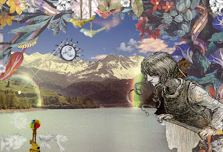
landscape!


Websites Used.

http://spongexd.deviantart.com/art/Sing-Swing-88182967

http://images.google.com/imgres?imgurl=http://pdb1.mydeco.com/product_images/full/6722ec3932d0635192ea3b382a66992111b12a3a.jpg&imgrefurl=http://mydeco.com/p/set-of-three-antiqued-metal-hanging-birds/3ccda845d436562d2abc79c94018d6bd630cc92d/&usg=__h40qfy7W4v2OdU4mfZXaKngD7ok=&h=500&w=500&sz=19&hl=en&start=20&um=1&tbnid=3A-cmtLtpwQ0fM:&tbnh=130&tbnw=130&prev=/images%3Fq%3Dhanging%2Bbirds%26hl%3Den%26client%3Dfirefox-a%26rls%3Dorg.mozilla:en-US:official%26sa%3DG%26um%3D1

http://orlandothree.deviantart.com/art/Landscape-86232139

http://kyngdok.deviantart.com/art/Looking-Over-101758234

http://mattahan.deviantart.com/art/Purple-Hand-42937907


i really enjoyed making this landscape. it was an assignment with a lot of freedom and i really just let the process take me where ever. its a landscape made of mostly fantasy and vibrant colors. i really used what i had learned all semester and applied it to this assignment.

Tuesday, April 14, 2009

fixer-upers


before and after! i worked really hard on these but i am very unhappy with the way in which they turned out. this was my first time really using these tools and i need lots more practice.

Tuesday, April 7, 2009

Scanner Project!!

My sister and i both save all of our movie stubs and between the two of us we must have hundreds. These are just a few of ours that i chose in a grid pattern. I had some difficulty using the contact sheet application on photoshop so i found it easier to just copy and paste them in separately. I am very happy with the way this project turned out!

Tuesday, March 31, 2009

Drawing to Photoshop


I really enjoyed doing this t was really fun for me to take a regular pattern that i do on all of my notebooks and create something digital from it. Playing with photoshop this way is really teaching me new techniques and is making me a lot more comfortable with the program! hope you like it! sorry it was so late :(

Monday, March 30, 2009

second transformation assignment


I love doing these. I liked being able to think up ridiculous things and being able to create them. I had a hard time executing some of the images the way in which i wanted them but I do feel as if I am getting a lot better at photoshop as i continue working.

Chip Kidd Response

Chip Kid was not what i expected at all, I must be honest. Lectures most of the time are monotonous and repetitive but his lecture was lively and relatable. I really enjoyed his passion for comics and his opinions on the business of graphic design. Showing both truth of the business through his slides and the ideas behind his work in a comical manner really made me respect his success and character. His narration of the comic books was very enjoyable and i think i burst into laughter more times than once. Overall i was very impressed, this was the first lecture I can truly say I payed attention for the entire time and really got a lot out of. 

Monday, March 23, 2009

transformation 1

I loved doing this project. I had some issues with photoshop but am very happy with the final product. 

Tuesday, March 3, 2009

Olan Montgomery self portrait


Here's my self portrait composed in Olan Montgomery's style done on illustrator. i had a lot fun doing this, its kinda sloppy but it worked out a lot better than my last self portrait i think. im still getting used to the program but this is a lot more my style than the other pieces i did.

Tuesday, February 24, 2009

olan montgomery


i chose for my artisit olan montgomery. i had no idea who to chose so on google i typed in portrait artist. i was drawn to his bright and fun colors and enjoyed researching about his work. heres a little bit about him...

Olan is a second generation New York pop artist. In an interview he states he focuses on eyes in his work because they can tell a story and are windows to the soul. He is an extreame activist and his current show consists of all of his work covered in plastic to convey the amount of trash society produces. He creates bright vibrant pieces to portray people from all walks of life, from celebrities to those who are homeless. He uses his work to recapture all that moment can offer. 


"Art can beautiful and push the envelope at the same time," states artist Olan


this was my version of his artwork....


self portrait


i made this collage out of paper and transferred the same idea to the computer using illustrator. i had the hardest time making it look similar and am not happy with its results. it looks a lot cooler on paper!

Tuesday, February 17, 2009

kitten via illustrator


i absolutely love this cat. it was my first time using illustrator and really enjoyed it. i like the bright colors that i chose although it looks kind of clown like.  

Tuesday, February 10, 2009

Illustrator!


meet the stick family. it was my first time ever attempting illustrator. i think they turned out pretty good. 

my first logo i created was one of the city. i chose the city because after just moving to the phillyand really acclimating i've grown to feel as if it were really home.

me second logo is a palm tree. i love the beach and palm trees and doodle them all the time. i collect little palm trees and if i could have a real one in philadelphia i would.


Thursday, January 29, 2009

6 word memoir

my six word memoir:
i am always one holiday behind.

i think that i did this project about 100 times. i really liked working with word. i had no idea it could do so many things! but i chose this one because my mom for every holiday except mothers day always gets me some sort of festive socks. so i have grown to have a huge collection of completely ridiculous socks. i love it :)

Tuesday, January 27, 2009

Helvetica

this movie was really intense. i had no idea that people were so enthusiastic about type, but it does make sense the impact that it has. i never thought of it like the way in which the creators presented it. here are some examples of helvetica in the real world..

helvetica2.jpg'

Helv-logos.jpg

comments on 3 of jille's websites...

ordinary comics.
i thought this website was awesome. the little comics are simple and interesting and i enjoyed looking through the different days of the calendar. i like how the artist took everyday objects and made them into something beautiful.

1000 journals.
i thought this website was pretty cool. i liked being able to compare how some people use their sketchbook because i am just starting mine for another class. its really inspiring how people people can take 2 simple pages and do so many different things.

core77.
i found this website really interesting. while browsing through i found references on school, photography and various opportunities being advertised. i think this site is really cool and helpful and i will definitely keep it for the future!